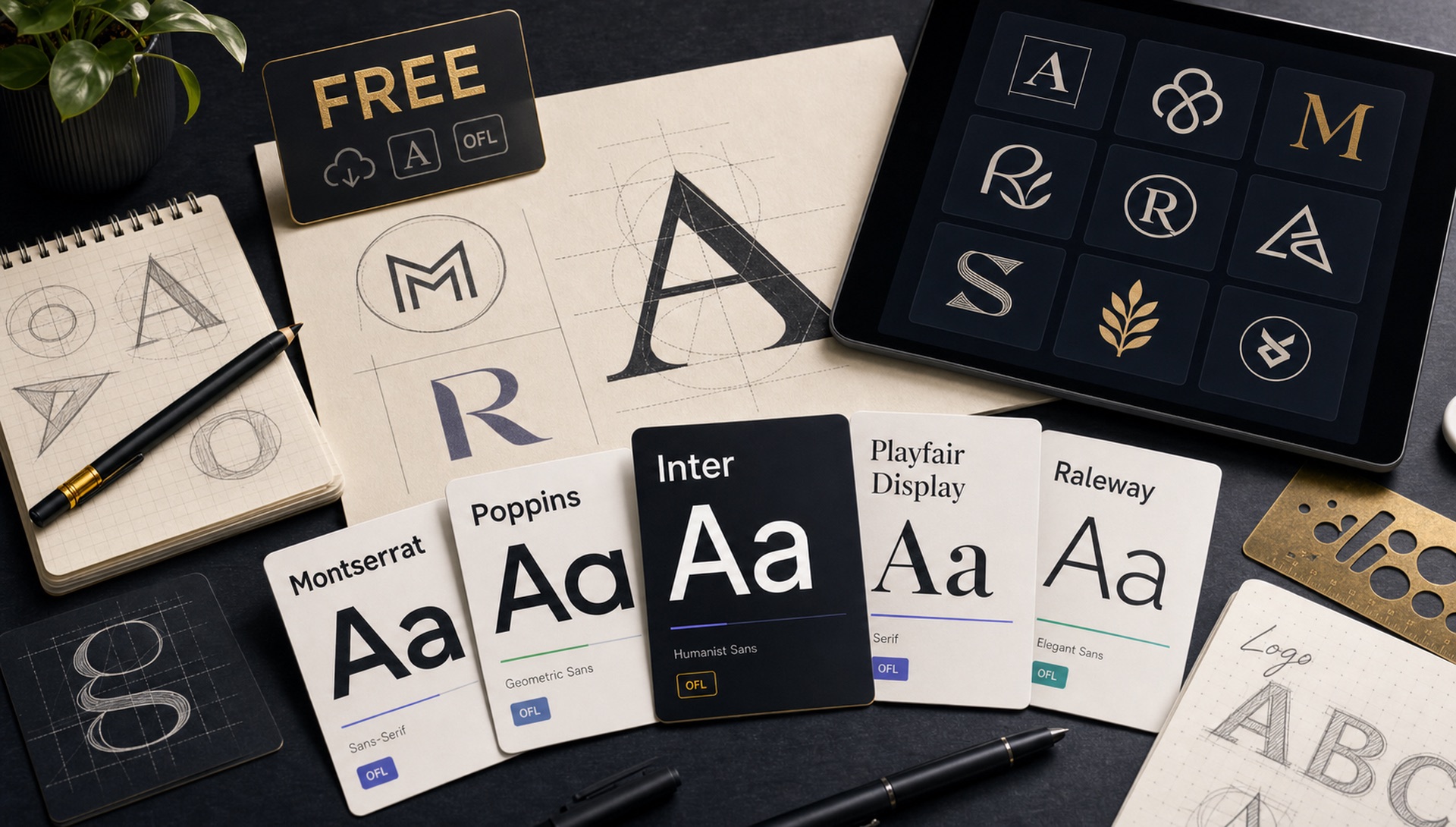
Great logo typography doesn't require expensive font licenses. These 15 free typefaces — all available under the OFL (Open Font License) — deliver professional quality at zero cost. Each one has been tested extensively in logo design contexts.
What Actually Makes a Font Work as a Logo
Before the list, it helps to know what you are judging. A logo font is doing a different job from a body text font, and the criteria barely overlap.
- It has to survive small. Your wordmark will appear as a 32px favicon, a social avatar, and an app icon. Fine hairlines and tight counters — the enclosed spaces in letters like a, e and g — clog up and turn to mush at those sizes.
- It has to work in one colour. Embroidery, engraving, faxed invoices and single-colour print all strip away any gradient or shadow you designed around. If the wordmark fails in flat black, it fails.
- It needs distinctive letterforms, not distinctive decoration. Memorability should come from the underlying skeleton of the letters, which survives scaling, rather than from ornament, which does not.
- It needs enough weights to build a system. A logo never lives alone. You will need supporting text, and a family with a usable range saves you sourcing a second typeface later.
Display & Headline Fonts
1. Bricolage Grotesque
A variable grotesque with wide optical range. The "Extra Bold" weight makes a strong logo statement while the regular weight works beautifully for supporting text. Used by dozens of SaaS startups.
2. Playfair Display
High-contrast editorial serif with dramatic thick-to-thin transitions. Perfect for luxury, fashion, and lifestyle brands. Pairs beautifully with a clean sans-serif.
3. Syne
Quirky geometric sans that feels modern without being generic. The Extra Bold weight has strong brand personality ideal for creative agencies and design studios.
4. Space Grotesk
Slightly irregular grotesque that feels "handmade" compared to more geometric options. Works beautifully for tech brands that want warmth without sacrificing clarity.
5. Cabinet Grotesk
A tall, condensed grotesque with strong vertical rhythm. Excellent for wordmark logos where width is constrained.
Clean & Versatile
6. DM Sans
Designed specifically for digital interfaces but equally powerful in logo contexts. The geometric construction gives it authority while the humanist details keep it friendly.
7. Outfit
Modern, clean, and approachable. Works at any size from a favicon to a billboard. The variable weight range gives you complete control over personality.
8. Plus Jakarta Sans
Strong personality in the display sizes, readable and clean at small sizes. A genuinely versatile choice for startups that want to grow into their typography.
9. Nunito
Rounded terminals give it a friendly, approachable quality. Popular in app and service brands targeting general consumers.
10. Josefin Sans
Classic geometric proportions with elegant thin and light weights. Reminiscent of 1930s geometric letterforms — ideal for fashion, beauty, and lifestyle brands.
Character & Personality
11. Clash Display
High-contrast grotesque with strong brand personality. Best used at large display sizes where the optical corrections create a sense of precision.
12. Cormorant Garamond
Ultra-high contrast Garamond interpretation with extraordinary elegance at display sizes. Luxury brands and editorial publications love this one.
13. Raleway
Elegant thin-to-heavy variable grotesque. The thin weight creates sophisticated wordmarks; the bold weight creates strong, confident ones.
14. Work Sans
Optimised for screens but works well at print sizes too. Corporate-friendly without being boring — a safe choice for professional services.
15. Lora
Contemporary serif with brushed curves. Ideal for editorial brands, publications, and content-forward companies that want typographic warmth.
Understanding the OFL Before You Ship
"Free" covers several very different licenses, and the distinction matters most in exactly the situation this article is about. The SIL Open Font License permits commercial use, permits logo and trademark use, permits embedding in apps and websites, and permits modification. That combination is why every font on this list qualifies.
The OFL does carry two real obligations. You may not sell the font files themselves, and if you modify and redistribute a font you must not use its Reserved Font Name. Neither restricts normal brand work — outlining a wordmark in your logo file is not redistribution, and shipping a webfont on your own site is explicitly allowed.
What trips people up is the wider category of fonts advertised as free. "Free for personal use" excludes commercial work entirely. "Free with attribution" under some Creative Commons variants is incompatible with a trademark. Demo weights distributed by commercial foundries are often a single weight of a paid family, licensed for evaluation only. Before a logo goes to a client, confirm the license type and archive a copy of it with the project files.
A Practical Way to Narrow 15 Down to One
Fifteen options is too many to choose between by feel. A repeatable process:
- Set your actual name, not the specimen. Type the real brand name in each candidate. Specimens are chosen to flatter a typeface; your name was not.
- Look for collisions. Check adjacent letter pairs that commonly clash — rn reading as m, capital I against lowercase l, VA and AV spacing. A name containing these needs a font that handles them cleanly.
- Shrink it to 32 pixels. Whatever survives legibly at favicon size stays on the list. This step usually eliminates half the candidates immediately.
- Print it in flat black. On paper, at a couple of centimetres wide. Screen rendering is forgiving in ways that ink is not.
- Sit with the last two for a day. Novelty fades fast, and the font that looked most exciting on first viewing is frequently the one that dates first.
Where to Download
All fonts listed are available on Google Fonts and downloadable free — use FontFinder's Browse section to preview them in your own text before downloading. If you arrived here with a logo you admire and want to know whether it uses one of these, upload the image to FontFinder and crop tightly around the lettering; the ranked matches will tell you whether you are looking at one of these families or at custom lettering that you will need to approximate instead.