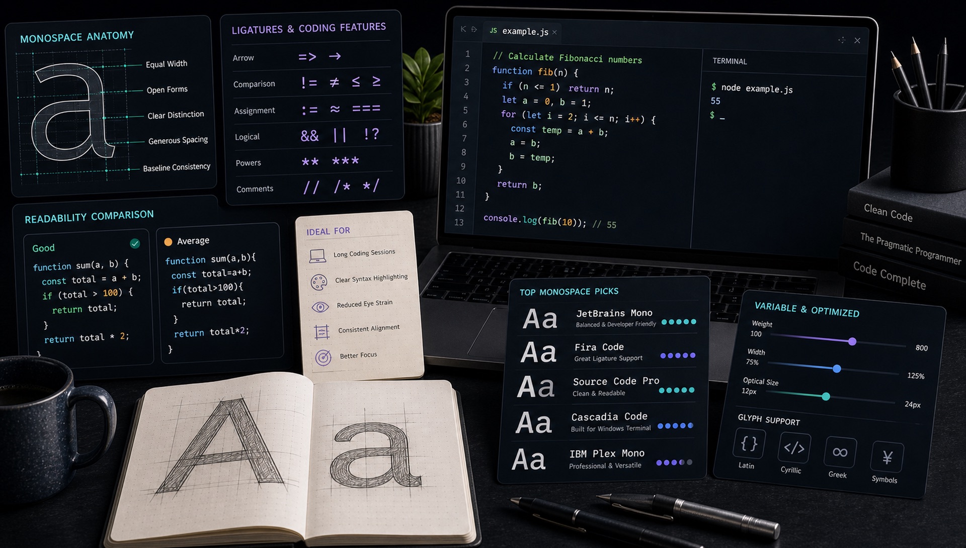
The monospace font you use for 8+ hours a day matters more than almost any other design decision. After extensive testing across screen sizes, operating systems, and rendering engines, here are the 10 best in 2025.
1. JetBrains Mono (Free)
Designed specifically for developers by the team behind IntelliJ. Wide characters improve readability; increased letter spacing at normal sizes; deliberate disambiguation of easily confused characters (0/O, 1/l/I). The ligature support is extensive and visually satisfying. Our top pick.
2. Fira Code (Free)
Famous for its extensive ligature set — programming symbols like => and !== render as single connected glyphs. Excellent x-height and strong contrast. One of the most popular developer fonts globally.
3. Cascadia Code (Free)
Microsoft's open-source monospace for the Windows Terminal and VS Code. Excellent ligature support, available in PL (Powerline) variant for terminal users. Perfectly tuned for Windows rendering.
4. Commit Mono (Free)
New entrant from 2023 that's rapidly gaining fans. Smart kerning system that's unusual for a monospace. Extraordinarily clean at small sizes. The developer community's "hidden gem."
5. Monaspace (Free)
GitHub's 2023 monospace family — five distinct fonts (Neon, Argon, Xenon, Radon, Krypton) with texture healing that makes mixed-weight text more readable. Highly innovative typography for a developer context.
6. Recursive (Free, Variable)
Not exclusively a monospace, but its MONO variant is outstanding. The unique feature: a "Casual" axis that slides from stiff/mechanical to relaxed/handwritten. Variable font with five axes — the most flexible monospace available.
7. IBM Plex Mono (Free)
IBM's open-source typeface family includes an exceptional monospace variant. Technical precision with warmth — feels authoritative without being cold. Available in full Latin, Cyrillic, Greek, Hebrew, Arabic, Thai, Japanese, Korean, and Devanagari.
8. Source Code Pro (Free)
Adobe's open-source monospace. Part of the Source family alongside Source Sans and Source Serif. Extremely legible at small sizes. The benchmark for clean, professional developer typography.
9. Iosevka (Free, Highly Configurable)
The most configurable monospace available. Build your own variant with custom character shapes, ligatures, and weights. Extremely narrow default proportions — you can fit 30% more code on screen. Community favourite for power users.
10. Hack (Free)
Explicitly designed for source code. Strong disambiguation of similar characters. Excellent readability at the small sizes used in dense coding environments. The simplest, cleanest option on this list — no bells and whistles, just impeccable functionality.
What Actually Makes a Good Coding Font
The differences between the fonts above are smaller than the marketing suggests. These are the properties that genuinely affect how it feels after eight hours:
- Character disambiguation. Can you instantly tell apart
0andO,1andlandI,rnandm? A slashed or dotted zero is the single most valuable feature a coding font can have. - Generous x-height. Code is read at 12–14px. A large lowercase relative to the caps keeps it legible at those sizes.
- Punctuation weight. Braces, brackets, semicolons and dots carry as much meaning as letters in code, but many fonts draw them too lightly to scan quickly.
- Distinct bold and italic. Syntax highlighting themes rely on both. Faux styles look muddy.
- Consistent advance width. Column alignment breaks the moment a glyph deviates — this is what "monospace" is actually for.
- Comfortable at your line height. Most editors default to 1.2–1.4. Fonts with tall ascenders can feel cramped there.
The Ligature Question
Programming ligatures render =>, !== and -> as single connected glyphs. Developers are genuinely split on them, and both positions are reasonable.
In favour: operators become single visual units, which reduces the parsing work your eye does. Dense functional code with heavy arrow syntax reads noticeably faster.
Against: the rendered glyph no longer maps one-to-one to the characters in the file, which matters when you are counting characters, teaching, pair programming, or debugging a typo. Some ligatures also disguise the difference between = and ==.
Both JetBrains Mono and Fira Code let you disable ligatures while keeping everything else. Try a week each way before deciding — this is genuinely a preference, not a correct answer.
Beyond the Editor
Monospace fonts do work outside code windows, and the requirements shift:
- Terminal use — check that the font ships a Nerd Font or Powerline variant if your prompt uses glyph icons. Cascadia Code PL and Iosevka handle this natively.
- Documentation code blocks — pick something that harmonises with your body font. IBM Plex Mono next to IBM Plex Sans is effortless.
- Data tables and dashboards — you often want tabular figures rather than a full monospace. Many proportional fonts offer them via
font-variant-numeric: tabular-nums. - Design and branding — Space Mono and Recursive Mono carry enough personality to work as display type for technical brands.
Setting It Up Well
- Size: 13–15px is the common range. Larger than you think is usually better for a full working day.
- Line height: 1.4–1.6. Tighter than that makes long files exhausting.
- Letter spacing: leave it alone. Monospace fonts are already spaced to a fixed grid.
- Enable font smoothing appropriate to your OS, and check the font at your actual display density — a font that looks superb on a Retina screen can look thin and fragile at 1x.
- Turn on a slashed or dotted zero if your font offers it as a stylistic set. Many do, off by default.
Which One Should You Pick?
If you want a decision rather than a list: JetBrains Mono is the best default for most people — excellent disambiguation, comfortable proportions, ligatures you can switch off. Pick Iosevka if screen real estate matters and you want to fit more columns. Pick Monaspace if you want something genuinely novel. Pick Hack or Source Code Pro if you want maximum clarity with zero personality.
Why Monospace Fonts Are Harder to Design Than They Look
Every glyph in a monospace font occupies the same horizontal advance width. That sounds like a simplification, but it is the central design constraint, and it creates problems a proportional font never faces.
An i and an m must fill the same box. The narrow letters need serifs, flags, or widened terminals so they do not look lost in their cell, while the wide letters must be compressed without becoming illegible. Get this wrong and the text develops a spotty, uneven colour that makes long files tiring to read. This is why so many monospace fonts add a distinct serif to the lowercase l and a curved tail to the i — those details are not decoration, they are width compensation.
The same constraint explains why monospace italics are often disappointing. A true italic redraws letterforms, but the redrawn shapes still have to fit the fixed grid, so many families ship an oblique — a mechanically slanted roman — instead. When you are evaluating a font for syntax highlighting that leans on italics for comments, check whether you are getting a real italic or a slant.
Rendering Differs More Than You Expect
A monospace font that looks perfect on one machine can look thin, fuzzy, or heavy on another, because the three major platforms rasterise text differently. macOS renders relatively heavy with generous anti-aliasing, which flatters lighter weights. Windows applies aggressive hinting that snaps stems to the pixel grid, so fonts with strong hinting instructions (Cascadia Code, Consolas) hold up much better there. Linux varies by configuration, and results depend heavily on your FreeType settings.
The practical implication: test your choice on the machine you actually work on, at your actual display density and your actual font size. A font that looks superb in a marketing specimen rendered at 48px on a Retina display can look fragile at 13px on an external 1080p monitor. If you switch between machines regularly, favour a font with solid hinting and a slightly heavier default weight — it will degrade more gracefully.
Spotted a monospace in a screenshot or a terminal recording and want to know what it is? Upload the image to FontFinder — code screenshots are among the easiest cases to identify, because the letterforms are clean, high-contrast, and rendered at a consistent size.