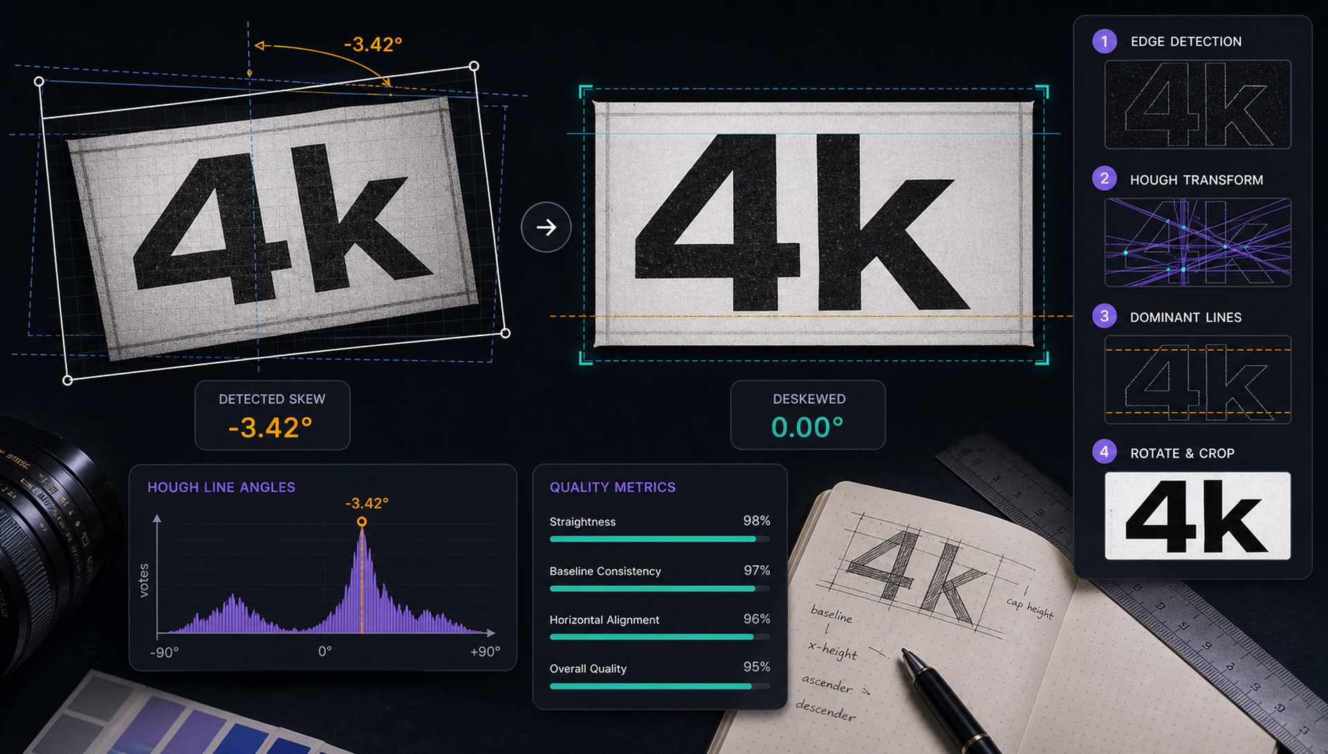
Take a photo of a street sign, a product label, or a book cover. Chances are it's not perfectly straight. The camera was tilted, the object was at an angle, or you were in a hurry. Even a 3-degree rotation can degrade font recognition accuracy by 15-20%.
FontFinder's deskewing step corrects rotation automatically before the image reaches our AI model. Here's exactly how it works.
Why Rotation Matters So Much
Our MobileNetV2 model was trained on rendered font samples — clean, horizontal text. When you feed it rotated text, the spatial relationships between features shift. A character that looks like an 'H' when horizontal might look like an unusual 'A' when rotated 45 degrees. Even small angles change the gradient orientations that the model uses to identify letterforms.
Method 1: Hough Line Transform
The Hough Line Transform is a classical computer vision technique for detecting straight lines in images. Applied to binarised text, it finds the dominant line angles — because text on a page creates many parallel horizontal lines (baselines, x-heights, cap heights).
We accumulate votes in angle-space: each edge pixel votes for every line that could pass through it. The angle with the most votes is the dominant text direction. We subtract 90 degrees to get the rotation correction angle.
Method 2: PCA Fallback
Hough transforms struggle on images with sparse text — a single word, a logo, or a stylised headline. For these cases, we fall back to PCA (Principal Component Analysis) of the foreground pixel coordinates.
We collect the (x, y) coordinates of all dark pixels in the binarised image and compute the principal components — the axes of maximum variance. The primary axis is aligned with the dominant text direction. We rotate to align this axis with horizontal.
Applying the Correction
Once we have the rotation angle, we apply an affine transformation to the image. We rotate around the image centre to avoid translation artifacts. Areas outside the rotated image boundary are filled with white (matching our text-on-white convention).
We limit corrections to ±45 degrees — beyond that, the text is likely intentionally angled (a stylistic choice) rather than an accidental rotation.
Choosing Between the Two Methods
We do not pick one method per image type in advance. Instead we run the Hough transform first and evaluate its confidence: how sharply peaked the accumulator is relative to its background. A dense block of body text produces a single dominant spike and a confident answer. A three-letter logo produces a flat, ambiguous accumulator, and that flatness is the signal to fall back to PCA.
PCA has its own blind spot, worth naming. It finds the axis of maximum variance in the pixel cloud, which aligns with the text baseline only when the text is meaningfully wider than it is tall. Give it a single tall capital letter, or text stacked vertically, and the principal axis points the wrong way — often by exactly 90 degrees. We guard against this by rejecting corrections where the two principal components have similar magnitudes, which is the mathematical signature of a shape with no clear orientation.
Rotation Is Lossy — Which Is Why We Do It Once
An affine rotation is not a free operation. Destination pixels almost never land on source pixel centres, so every rotated image is resampled through interpolation. We use bicubic sampling, which preserves stroke edges better than bilinear, but some softening is unavoidable: fine serifs and hairlines lose a little definition each time.
The practical consequence is that the pipeline is ordered deliberately. Deskewing happens once, after binarisation and before cropping, and the angle is never refined in a second pass. Two successive rotations of 2 degrees produce a visibly softer image than a single rotation of 4 degrees, and softer strokes mean weaker features for the model downstream.
Why the Correction Is Capped at 45 Degrees
The cap exists to protect intentional design from being "fixed." Diagonal text is a deliberate choice in a large fraction of the images people upload — sale banners, sports jerseys, event posters, packaging seals. Beyond roughly 45 degrees, the far more likely explanation is that the designer meant it, not that the camera slipped.
There is a second reason. Above 45 degrees, the ambiguity between a line and its perpendicular becomes genuinely unresolvable from geometry alone. Without reading the text, there is no way to distinguish a baseline rotated 60 degrees from a stem direction rotated minus 30. Rather than guess and be confidently wrong half the time, we leave the image alone and let the crop tool give the user manual control.
Results
Adding the deskewing step produced a clear improvement in top-1 accuracy on our internal evaluation images. The largest gains came from photos of physical objects — packaging, signage, and printed materials — where small rotations are nearly universal. Screenshots, which are almost always perfectly axis-aligned to begin with, saw essentially no change, which is the expected result: the step correctly identifies that there is nothing to correct and passes the image through untouched.
What This Means for Your Upload
You do not need to straighten images before uploading — the pipeline handles ordinary camera tilt on its own. But two habits still help. First, hold the camera parallel to the surface rather than merely level, because deskewing corrects rotation and not perspective. Second, if the text is genuinely angled by design, use the manual crop tool and accept the angle rather than fighting it; a tight crop on rotated lettering usually outperforms an automatic correction that was never meant to fire.