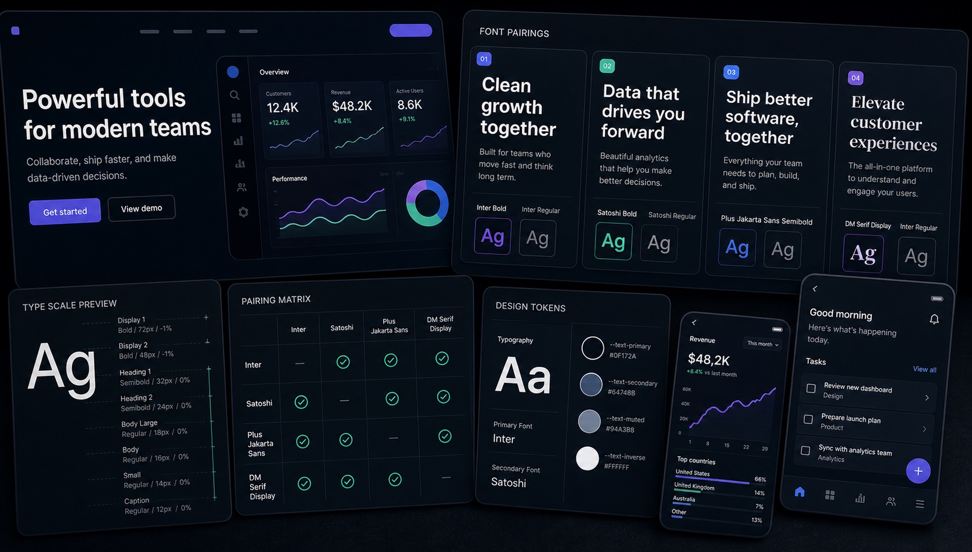
We analysed the typography of 20 of the most admired software products in the world. The patterns we found reveal clear typographic trends in the SaaS design language of 2024-2025.
The Dominant Pattern: Custom + Inter
The most common pattern: a distinctive custom or licensed display font for headlines combined with Inter for UI text and body copy. This reflects Inter's status as the uncontested UI font standard — designers trust it for functional text, and reserve typographic personality for display elements.
Company by Company
Linear — Custom "Linear" sans for headlines + Inter for body. Ultra-precise, dark aesthetic. The epitome of developer tooling aesthetics in 2024.
Vercel — Geist (their own open-source font) across the entire product. Bold statement: if you're confident enough to design your own typeface, use it everywhere.
Figma — Inter across the board for UI, with occasional use of platform system fonts for editor interfaces.
Notion — A modified version of Gotham (headline) + the system sans-serif stack for document content (allowing users to customise their document typography).
Loom — Circular (licensed) for all brand communications. One of the few SaaS companies that commits to a premium licensed typeface across everything.
Stripe — Camphor (custom) for product, with Saans for editorial. Stripe's typography is extraordinarily considered — they've invested heavily in typographic systems.
Framer — Bricolage Grotesque (display) + Inter (UI). Possibly the combination that made Bricolage so popular in the SaaS design community.
GitHub — Mona Sans (their own custom) + Monaspace (their own custom monospace). Following the trend of tech companies commissioning custom typefaces.
GitLab — Inter across both marketing and product. Clean, consistent, low-risk.
Atlassian — Charlie Display (custom) + Charlie Text (custom). A complete custom type system for a brand operating at scale.
Key Findings
- Inter is the most used font — appears in ~60% of the companies examined
- Custom fonts are increasing — 40% of companies now use partially or fully custom typefaces
- Variable fonts are standard — all major design systems have adopted variable fonts for performance
- Serif fonts are nearly absent — only one company uses a serif in their primary brand typography
Why the Split Exists
The display-plus-neutral pattern is not a style choice that happened to spread. It falls out of the fact that marketing pages and product interfaces have opposite typographic requirements.
A landing page has one job for about three seconds: establish who you are and why this is different. Type is one of the few tools that works before anyone reads a word, so distinctiveness pays. The page also contains very little text, which means a display face with a limited character set and no italic is perfectly adequate.
A product interface has the reverse brief. Users spend hours in it, reading dense labels at small sizes, and every gram of personality becomes friction. What matters is a large x-height, unambiguous letterforms, tabular figures that keep numeric columns aligned, and enough weights to build a hierarchy. Inter was designed for precisely this, which is why it dominates the product column and rarely appears in the headline column.
Reading the pattern this way also tells you when to break it. If your product is itself a design or content tool, the interface is part of the pitch and can carry more character. If your marketing page is documentation-heavy, the display face belongs in the hero and nowhere else.
The Practical Cost of Custom
Forty percent of the companies examined use custom or exclusive typefaces, which can read as a benchmark worth reaching for. It is not, for almost anyone. A commissioned family is a six-figure engagement and a year of lead time, plus ongoing work every time you need a new weight or script. Vercel, GitHub and Atlassian can absorb that; a Series A company cannot, and the return would be close to zero at their scale.
The cheaper substitute captures most of the benefit. Take a well-drawn OFL family, use it with genuine care — considered optical sizes, deliberate tracking at display sizes, a consistent modular scale, hand-kerned wordmark — and the result reads as more considered than an expensive typeface applied at defaults. Craft in application is visible to users. Provenance is not.
Auditing Your Own Typography
A short exercise that surfaces most real problems:
- Screenshot your marketing hero and your densest product screen side by side. If the display font appears in the product screenshot, that is usually the first thing to fix.
- Count the distinct type sizes across both. More than six or seven means you have no scale, just accumulated decisions.
- Check numerals in any table or dashboard. If columns do not align, you need tabular figures —
font-variant-numeric: tabular-nums. - Set your smallest UI text to weight 400 and read it on a phone in daylight. Anything below 400 at small sizes will fail for a meaningful share of your users.
- Measure webfont payload. Two families across all weights is easy to overload; subsetting and variable files usually cut it substantially.
What This Means for Your Brand
If you want to look like a credible SaaS company in 2025, the formula is: Inter (or DM Sans/Plus Jakarta Sans) for your product UI + a distinctive variable grotesque (Bricolage, Syne, Space Grotesk) for your marketing headlines. Free, performant, professional.
The caveat is that following the formula exactly produces a page that looks like every other page in the category. Use the structure, then choose a display face with fewer sightings than the obvious candidates. If you spot a pairing in the wild that works, upload a screenshot of the headline and a screenshot of the body text to FontFinder separately — they are almost always two different families, and identifying them one at a time gives far better matches than cropping both together.