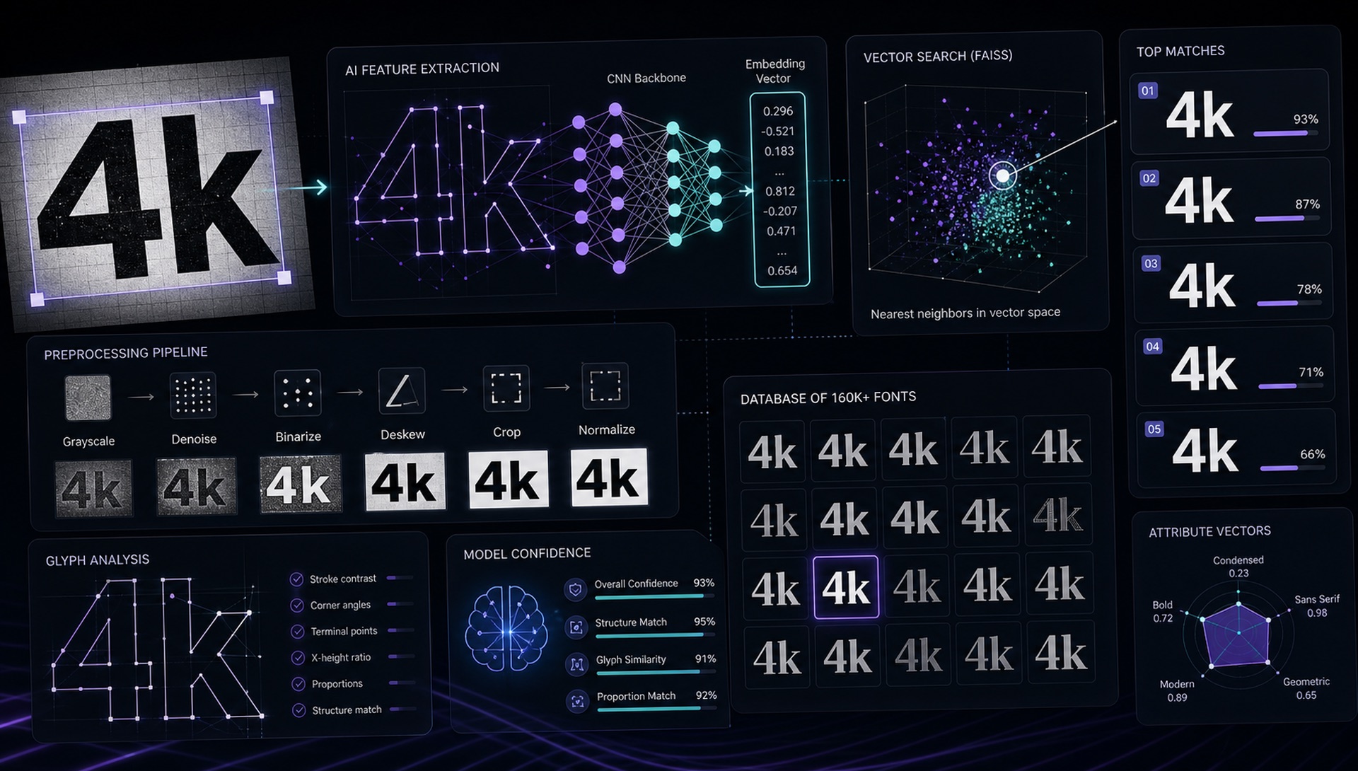
Font identification has existed as a design challenge since the dawn of typography. For most of that history, it required expert human knowledge. The AI revolution is changing this fundamentally — here's how.
The Old Methods
Before AI, the gold standard was human experts. Large type foundries employed typographers who could identify fonts from a single word — sometimes from a single letter. This knowledge was expensive and slow.
The first algorithmic approach was feature-based matching: extract measurable characteristics from letterforms (cap height, x-height, serif presence, stroke width ratio) and compare them against a database of known measurements. This worked for clean, high-quality images but failed completely on real-world photos.
The Neural Network Revolution
Modern font identification systems — including FontFinder — use convolutional neural networks trained on rendered font samples. The model learns to identify fonts not through explicit rules, but by exposure to millions of examples.
FontFinder uses MobileNetV2, a lightweight neural architecture optimised for inference speed. We extract 1,280-dimensional embedding vectors from each image — these vectors encode the visual "fingerprint" of the letterforms. To identify a font, we compare the query embedding against our database of 67,462 font/style sample embeddings using FAISS (Facebook AI Similarity Search) — a library optimised for billion-scale vector search.
Why Image Preprocessing Still Matters
The fundamental challenge of font identification AI is the domain gap: models trained on clean rendered fonts must work on noisy real-world photos. Our preprocessing pipeline (OpenCV denoising, Otsu binarisation, deskewing, bounding box cropping) is what bridges this gap. The AI quality is table stakes — the preprocessing quality is the differentiator.
What's Next: OCR + Font Detection Together
The next generation of font identification will combine OCR (optical character recognition) with font detection in a unified model. Rather than treating "what does this say?" and "what font is this?" as separate problems, a joint model can leverage each task to improve the other.
FontFinder already combines these approaches: Tesseract OCR identifies the text in your selection, which then becomes the preview text for each font result — showing you exactly how your detected text looks in each matching typeface.
Why Embeddings Beat Classification
An architectural choice worth explaining, because it shapes what the tool can and cannot do. The obvious design for font identification is a classifier: a final layer with one output per font, trained to predict which of N fonts an image shows. It works, and it has a fatal operational flaw — adding a font means retraining the model.
The embedding approach avoids that. The network is trained to map images into a vector space where visually similar letterforms land near each other, and it never learns a fixed list of font names at all. Identification then becomes a nearest-neighbour lookup: embed the query, search the index, return what is closest. Adding a font means rendering samples, embedding them, and inserting the vectors into FAISS. No retraining, no downtime.
The second advantage matters more to users. A classifier is obliged to distribute probability across fonts it knows, so an unknown typeface produces a confident answer that is simply wrong. A nearest-neighbour search returns genuine visual neighbours with real distances attached — which is exactly the right output when the true answer is custom lettering that exists in no index anywhere.
What AI Still Cannot Do Here
The gap between the current state of the art and the way this technology is usually described is worth being blunt about.
- Distinguishing near-identical revivals. Dozens of Garamond and Helvetica derivatives differ by a fraction of a percent in stroke width or terminal angle. At screenshot resolution those differences are frequently below the noise floor, and no model recovers information the pixels do not contain.
- Reading intent. A model cannot tell you whether a designer used a font at default settings or modified it. It reports visual similarity, which is not the same question.
- Handling the very long tail. Coverage is bounded by the index, and any index is a small fraction of what exists.
- Making licensing decisions. Identification tells you what something looks like. Whether you may use it is a legal question with no visual signal.
The Long Tail Problem
There are estimated 500,000+ commercially available typefaces in existence. Training a recognition model across all of them requires either an enormous training dataset or architectural innovations that allow few-shot learning (identifying fonts from very few examples). Current state-of-the-art tools often cover thousands to tens of thousands of font samples accurately. Reaching coverage of 100,000+ fonts is an active research area.
Scale alone does not solve it, either. As an index grows, the vector space becomes more crowded, near-duplicates multiply, and the top ten results fill up with variations of the same design — technically correct and practically useless. Beyond a certain size, the hard problem stops being coverage and becomes presentation: clustering visually equivalent results so the user sees ten distinct options rather than ten cuts of one.
What This Means If You Are Using These Tools
The realistic framing is that AI has moved font identification from expert knowledge to a shortlist you evaluate yourself. That is a genuine shift, and it is not the same as a solved problem. Treat ranked matches as candidates to verify rather than answers to accept: compare signature letters — g, a, R, Q and the numerals — against your source, set your own text in the top candidates, and check the license before anything ships. The tool narrows fifty thousand possibilities to five. Choosing between those five is still your judgement, and it is the part that determines whether the result is any good.