Photos are harder than screenshots because cameras add perspective, blur, glare, shadows, and texture. Still, a good photo can be enough to identify a font or find a strong similar match, especially when you capture the text cleanly and crop it with care.
Straight
Hold the camera parallel to the text whenever possible.
Bright
Use even lighting and avoid glare, reflections, and deep shadows.
Large
Move closer so the letters fill more of the image.
Single
Crop one font style before running the search.
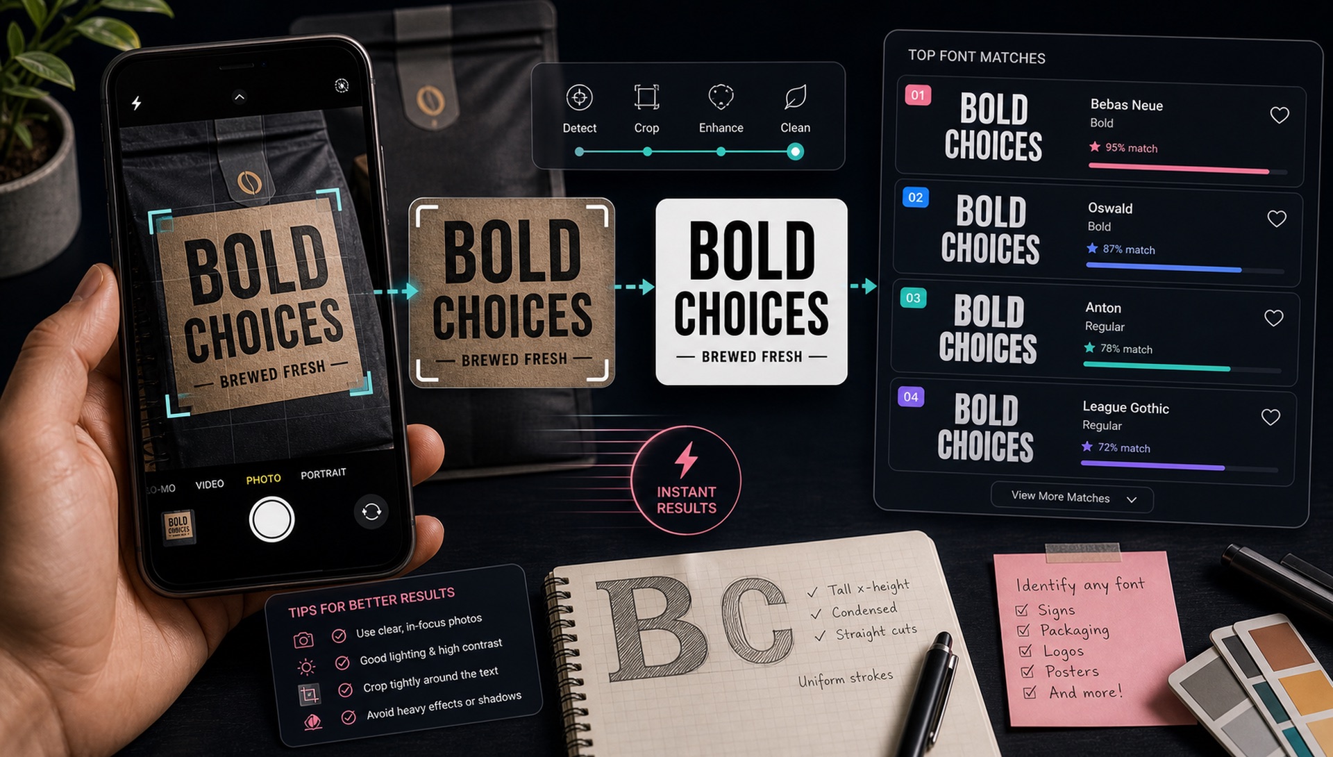
Take the Photo Like a Scanner
Stand square to the sign, package, poster, or label. Tap to focus on the letters, keep the phone steady, and take more than one shot. A slightly boring straight-on photo is better for font recognition than a dramatic angled photo.
Avoid Common Photo Problems
Glare can erase thin strokes. Shadows can make a clean font look rough. Curved packaging can stretch letters near the edge. If the surface is glossy or metallic, change your angle until the letter edges are easier to see.
Crop Before You Search
After uploading, crop only the word or phrase you want identified. Remove background imagery, icons, product photos, and other typography. If the photo includes a large headline and small supporting text, run them as separate searches.
Expect Similar Matches for Custom Lettering
Signs, logos, and packaging often use customized type. A font finder may identify the source family, or it may show visually similar alternatives. Compare the top results with your exact letters before choosing one.
Quick action: Upload a clean screenshot or photo to FontFinder, crop around one font style, and compare the ranked matches with your real text before you choose a license.
Photo Checklist
Use a straight-on, focused, well-lit photo. Crop tightly around one font style. Review several matches and confirm licensing. That is the most reliable way to identify fonts from real-world photos.