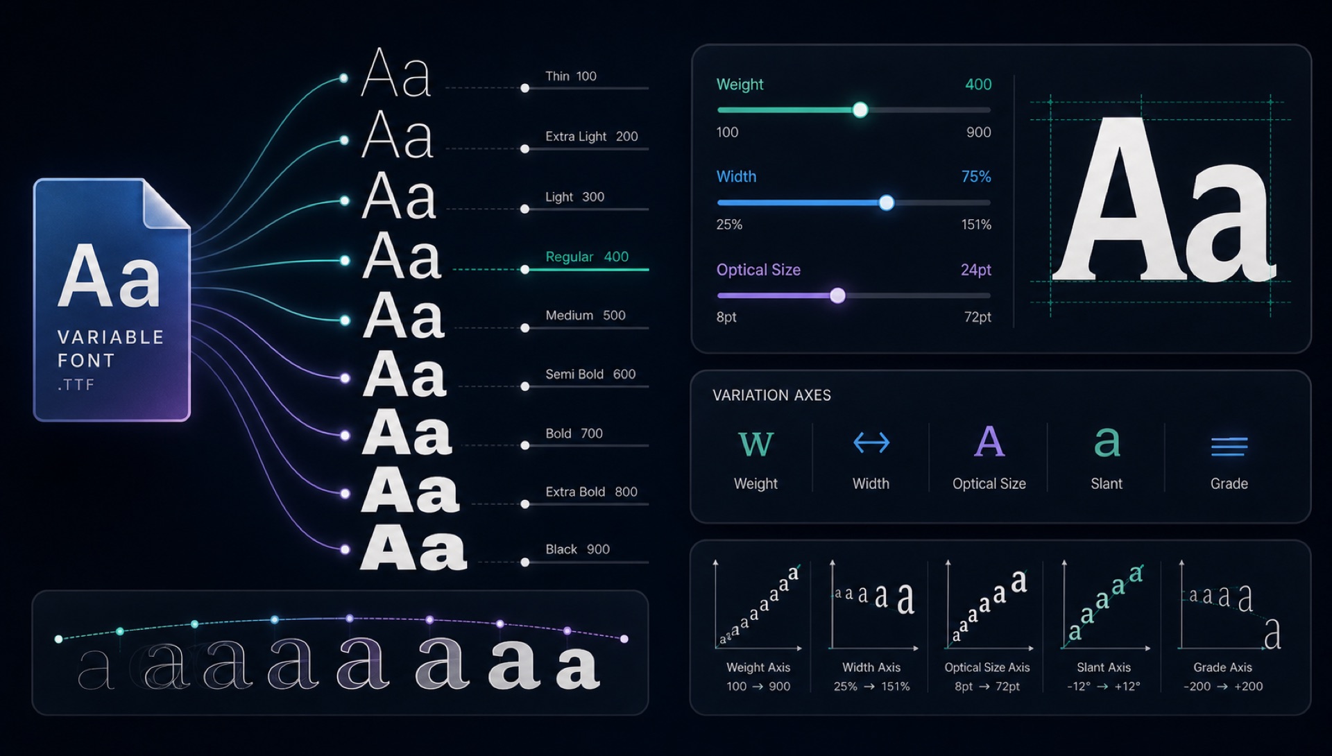
Variable fonts are the biggest innovation in type technology in decades. A single font file can replace dozens of individual weight and style variants — and it's revolutionising how designers and developers work with typography.
The Old Way
Traditional font families ship as multiple individual files: Roboto-Thin.ttf, Roboto-Light.ttf, Roboto-Regular.ttf, Roboto-Medium.ttf, Roboto-Bold.ttf, Roboto-Black.ttf — plus italic variants of each. To use a complete family, you might load 12 separate files, totalling several hundred kilobytes.
The Variable Font Way
A variable font stores the design at "master" positions (typically the extremes of each axis) and uses mathematical interpolation to generate any intermediate value. One file, infinite weights.
Roboto as a variable font: one file, all weights, all widths. At ~180KB instead of ~400KB for the full static family. And with CSS, you can access any value: font-weight: 347 — a weight that doesn't exist in the static family.
Variation Axes
Variable fonts can vary along multiple axes simultaneously:
- Weight (wght) — from hairline to ultra-black
- Width (wdth) — from condensed to expanded
- Slant (slnt) — from upright to oblique
- Italic (ital) — toggle between roman and italic
- Optical Size (opsz) — adjust details based on display size
- Custom axes — typeface-specific (e.g., "Casual" in Recursive)
Best Variable Fonts Available Free
- Inter — Variable weight, the designer's Swiss Army knife
- Bricolage Grotesque — Variable weight + width for display use
- Recursive — Five axes including a "Casual" personality axis
- Fraunces — Optical size variable serif with stunning detail at large sizes
- Raleway — Variable weight from ultra-thin to ultra-bold
Using Variable Fonts in CSS
@import url('https://fonts.googleapis.com/css2?family=Inter:wght@100..900&display=swap');

h1 { font-family: 'Inter', sans-serif; font-weight: 800; }
p  { font-family: 'Inter', sans-serif; font-weight: 400; }
The 100..900 range syntax loads the full variable font with all weights accessible. One HTTP request. One cached file.
Two details are easy to get wrong. If you request specific weights instead of a range — wght@400;700 — Google Fonts serves you static instances and you lose the variable behaviour entirely. And for axes beyond weight, CSS needs the lower-level property:
h1 {
  font-variation-settings: 'wght' 780, 'wdth' 85;
}
Use the standard properties such as font-weight and font-stretch wherever they exist, because browsers can optimise and animate them. Reserve font-variation-settings for custom axes that have no standard equivalent.
When a Variable Font Is the Wrong Choice
The single-file argument assumes you use most of the family. If your site only ever renders Regular and Bold, you are downloading a file that carries the design data for every weight from Thin to Black in order to use two of them. In that case two static woff2 files are genuinely smaller.
The rough decision rule: three or more weights and widths in active use favours the variable file; one or two favours static. Subsetting changes the maths too — a static Latin-only subset can be remarkably small, while variable fonts subset less dramatically because the interpolation deltas apply across the whole glyph set.
Interpolation Is Not Free Design
It is tempting to read a weight axis as a continuous dial that a computer generates automatically. It is not. The type designer draws the masters at the axis extremes, and often intermediate masters as well, precisely because naive interpolation produces bad letterforms in the middle. Counters close up, joins thicken unevenly, and diagonal strokes drift.
Well-made variable fonts include corrective masters at the points where the linear path would go wrong. This is why quality varies so much between families, and why a font with a huge axis range is not automatically better than one with a narrow, carefully drawn range. When evaluating a variable font, look at the middle of each axis rather than the ends — the extremes were drawn by hand, and the middle is where the engineering shows.
Identifying Variable Fonts in the Wild
Variable fonts complicate font identification in a way worth knowing about. When you upload a screenshot of text set at weight 437 and width 92, no static sample in any index matches those exact proportions. A matcher will return the nearest neighbours it has, which may be the correct family at the wrong weight, or a different family whose static weight happens to sit closer.
The practical response is to treat the family name in your results as the answer and the weight as a starting point. Once FontFinder has narrowed you to a family, load the variable version and adjust the axes yourself until the sample matches. That final step is manual, and it is usually faster than trying to get an exact numeric match out of the identification stage.