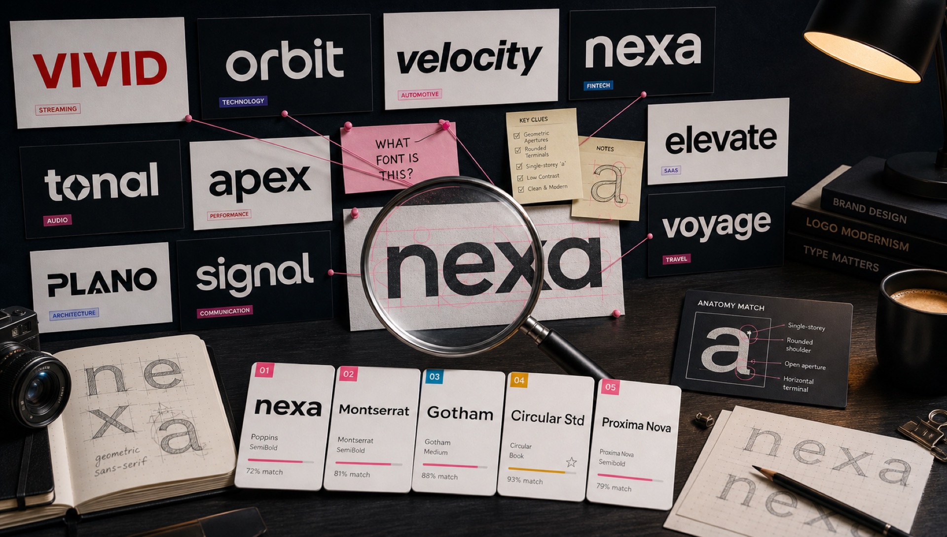
We ran the logos of 50 of the world's most recognisable brands through FontFinder and researched the typefaces behind each. Here are the highlights — plus the free alternatives you can use right now.
Tech Giants
Google — Product Sans (custom, not available). Free alternative: Nunito or Poppins.
Microsoft — Segoe UI (Windows system font). Free alternative: Inter or Source Sans.
Meta (Facebook) — Facebook Sans and Optimistic Display (custom). Free alternative: DM Sans.
Amazon — Amazon Ember (custom). Free alternative: Ember-like: Ubuntu or Source Sans.
Samsung — Samsung One (custom) / SamsungSharpSans. Free alternative: Outfit.
Consumer Brands
Nike — Futura Bold (the swoosh wordmark) / Trade Gothic. Free alternative: Josefin Sans (Futura-inspired).
Adidas — Adidas custom sans. Free alternative: Titillium Web.
Coca-Cola — Spencerian Script (the classic cursive) — an 1800s penmanship style. Free alternative: Pacifico for a similar casual script mood.
McDonald's — Lovin' It typeface (custom). The golden arch wordmark is highly customised.
Fashion & Luxury
Chanel — A version of serif letterforms with high contrast strokes. The Chanel logo itself is custom lettering.
Louis Vuitton — Custom LV wordmark. Similar feel to Futura or Optima.
Gucci — The Gucci wordmark is custom lettering. Free alternative for a similar classic serif feel: Cormorant Garamond.
Media & Entertainment
Netflix — Netflix Sans (custom, see full article). Free alternative: Nunito.
Disney — Waltograph (based on Walt Disney's handwriting signature). Free alternative: the Waltograph font is actually available free for personal use.
HBO — A version of Clarendon slab serif for the HBO logo. Free alternative: Roboto Slab.
CNN — CNN's logo uses a condensed sans reminiscent of Trade Gothic. Free alternative: Barlow Condensed.
Why So Many Answers Are "Custom Lettering"
Reading the list above, the most striking pattern is how often the honest answer is that there is no font. Coca-Cola, Chanel, Gucci, Louis Vuitton and McDonald's are all drawn, not set. That is worth understanding before you spend an afternoon hunting for a typeface that does not exist.
A logotype is a fixed piece of art used at every size, in every medium, forever. That is a completely different problem from a typeface, which must produce acceptable results for any word anyone might type. Because a logotype only ever has to spell one word, a designer can optimise every curve and every gap for that one word — tightening a specific letter pair, extending a particular terminal, balancing the spacing by eye rather than by metric.
Frequently the starting point was a font, which was then modified past the point of recognition. This is why identification tools return a plausible-looking family that is nonetheless not quite right: the underlying skeleton genuinely came from that typeface, and the surface no longer does.
Reading a Result That Says "Close, But Not Exact"
When your top matches all sit at similar confidence and none looks perfect, you are almost certainly looking at custom or modified lettering. That is useful information rather than a failure. The productive next move is to stop chasing the exact file and start identifying the attributes you actually want:
- Skeleton: is the underlying structure geometric (circular O, single-storey a) or humanist (slightly oval O, double-storey a)?
- Contrast: how much do stroke widths vary between thick and thin?
- Aperture: do letters like c, e and s open outward or curl closed?
- Terminals: are stroke ends cut horizontally, at an angle, or rounded?
- Proportion: what is the x-height relative to cap height, and how wide are the letters overall?
A font matching four of those five will read as the same family of idea to everyone except a typographer. That is a better outcome than an exact match you cannot license.
A Necessary Note on Trademark
Identifying the font behind a famous logo is straightforward research, and this article is written in that spirit. Using it is a different matter. The typeface and the trademark are separate things: Nike's swoosh wordmark uses Futura, and Futura is licensable by anyone, but the Nike logotype is protected regardless of what font it started from.
The line is about confusion, not about fonts. Setting your own brand name in Futura Bold is completely legitimate. Producing a mark that a consumer might mistake for Nike's is not, and no amount of font licensing changes that. If your logo concept requires looking similar to an existing brand, the problem is the concept.
The Key Pattern
The most globally valuable brands overwhelmingly use either (1) custom commissioned typefaces, or (2) modified versions of classic geometric sans-serifs like Futura, Helvetica, or Gill Sans. The custom typeface trend is accelerating — unique typography is one of the last truly ownable brand differentiators.
For a brand at any smaller scale, the takeaway is not to imitate the result but to imitate the process: choose a skeleton that matches the brand's character, then refine the spacing of your specific name by hand. Careful optical kerning on a free OFL typeface will outperform an expensive font used at default settings almost every time. To start, upload the logo you admire to FontFinder, note which attributes the top matches share, and shortlist from Browse on that basis.