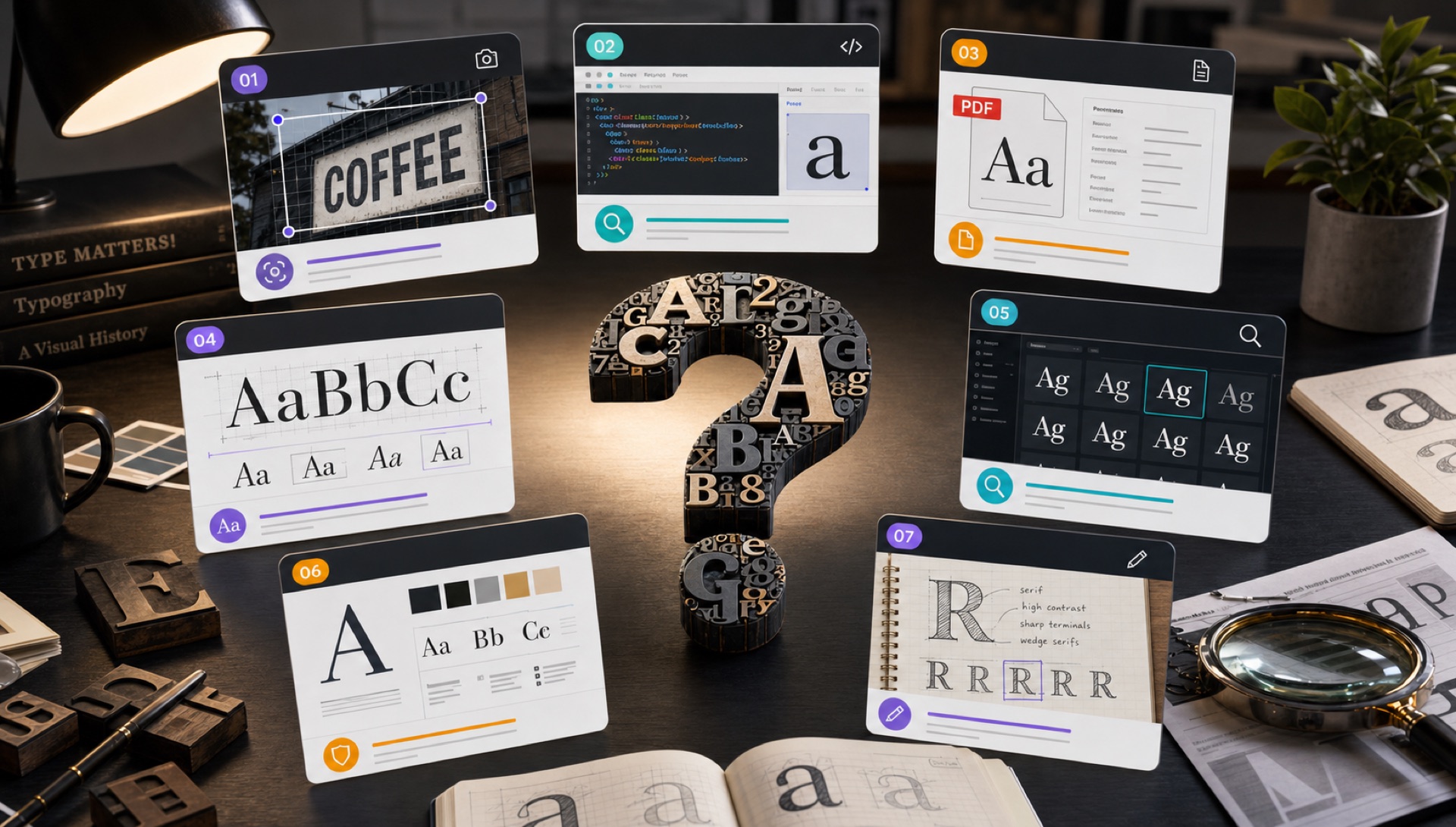
"What font is this?" is one of the most common questions designers ask because typography is everywhere, but font names are usually hidden. You may be looking at a website, a logo, a social media graphic, a PDF, a book cover, a product label, or a printed ad. The right method depends on whether the text is live, embedded, outlined, or only visible as pixels.
This guide gives you seven reliable ways to identify a font online. The goal is not only to get a name, but to understand when that name is trustworthy, when a result is only a close alternative, and what to do before using the font in a commercial project.
Image
Use FontFinder for screenshots, logos, packaging, ads, and social graphics.
Website
Inspect CSS when the text is selectable on a live page.
Check embedded fonts first, then screenshot if the text is outlined.
Manual
Compare signature letters when tools return mixed results.
1. Use an Image-Based Font Finder
If the font appears inside an image, the fastest answer is an image-based tool. Upload the image to FontFinder, crop around the exact word or phrase, and review the ranked matches. This works well for logos, screenshots, ads, product photos, posters, thumbnails, and flattened graphics because the tool studies the letterforms directly rather than relying on hidden metadata.
For best results, crop one style at a time. A social media post might use a bold display heading, a small caption font, and a handwritten accent. Run each one separately. If the sample is short, try to include the most distinctive letters available. If you can choose between several words, select the word with curves, diagonals, and lowercase letters rather than a word made only of simple vertical strokes.
2. Inspect Website Text in the Browser
If the font appears on a live website and you can select the text with your cursor, inspect the element in your browser. In Chrome, Safari, Firefox, or Edge, right-click the text, choose Inspect, and look for the CSS font-family property. This can reveal the exact web font, the fallback stack, and sometimes the weight and style being used.
There are two caveats. First, websites often define a stack such as Inter, Arial, sans-serif. The browser uses the first available font, so you need to know which one actually loaded. Second, some brands use custom font names in CSS, so the family name may not be the retail font name. Still, browser inspection is the cleanest method when the text is live HTML.
3. Check PDF Font Metadata
PDFs can include embedded font names. Open the file properties and look for the Fonts section. If the text is selectable and the PDF has not been flattened, you may see the exact font family and subset names. This is faster than image recognition because the answer comes from the document itself.
If the PDF has outlined text, scanned pages, or flattened artwork, metadata may not help. In that case, zoom to 200 or 300 percent, take a clean screenshot, crop one style, and run the image through FontFinder. PDF screenshots can be excellent samples because they are usually sharper than photos.
4. Search by Signature Letterforms
When tools disagree, manual comparison helps. Start with letters that reveal personality. A lowercase a can be single-storey or double-storey. A lowercase g can have a simple tail or a complex loop. An uppercase Q may have a short tail, a long sweeping tail, or a tail that cuts through the bowl. The R leg, the S curve, and the terminals on c and e are also useful.
Once you identify these details, compare candidate fonts side by side. Do not judge from the font name alone. Type the same word from the original image, use the same case, and match the weight as closely as possible. A correct family in the wrong weight can look like a wrong font.
5. Classify the Style Before Searching
Narrow the universe first. Is it serif, sans-serif, slab serif, script, display, monospace, blackletter, or handwriting? Is it geometric, humanist, grotesque, neo-grotesque, editorial, condensed, rounded, or high contrast? Even a simple classification makes search results easier to judge. If the original is a geometric sans with circular bowls, a humanist sans with calligraphic curves is probably not the answer.
This matters because many fonts share names or visual themes. A tool may return several close options from the same genre. Knowing the category helps you choose the one that fits the design intention, not just the one with the highest score.
6. Compare Similar Fonts When the Original Is Custom
Logos and packaging often use customized lettering. The designer may have started from a font, then modified the spacing, connected letters, adjusted terminals, or redrawn a character. In that situation, the exact font may not exist as a public download. The practical answer is to find a similar font that can reproduce the mood.
Look for the same proportions, contrast, and rhythm. Then consider licensing, language support, available weights, and web performance. A similar open-source family with many weights may be better for a website than an exact display font with limited usage rights.
7. Ask the Source When Appropriate
Sometimes the simplest answer is to ask the designer, agency, template creator, or brand owner. This is especially useful for active brand projects where licensing accuracy matters. If you are recreating a client asset, the client may have brand guidelines or font files already. Use tools to investigate, but do not ignore the possibility that the official answer exists in documentation.
Quick action: Upload a clean screenshot or photo to FontFinder, crop around one font style, and compare the ranked matches with your real text before you choose a license.
How Image-Based Font Detection Actually Works
Understanding the mechanism helps you feed it better input. When you upload an image, the pipeline runs roughly five stages. First, preprocessing converts the image to greyscale and thresholds it so the text becomes solid dark on solid light, stripping out gradients, textures, and background noise. Second, deskewing straightens a rotated baseline, because a tilted baseline changes letterform geometry and degrades matching badly. Third, character segmentation isolates individual glyphs and normalises them to a consistent height.
Fourth, a neural network converts each glyph shape into a numerical vector describing its geometry. Fifth, that vector is compared against a pre-built index of font samples and the closest matches are returned, ranked by distance. FontFinder searches an index built from 67,462 font samples. Two consequences follow: a font outside the index can never be returned exactly, and anything that distorts glyph geometry — blur, low resolution, heavy shadow, perspective skew — directly reduces accuracy.
Which Letters Give the Best Results
Not all characters carry equal identifying information. If you can choose what goes in your crop, prioritise these:
- g — single-storey or double-storey splits the field of candidates roughly in half immediately.
- a — the bowl shape, the spur, and whether it carries a tail are all strong signals.
- R — the leg can be straight, curved, or splayed, and it varies enormously between families.
- Q — the tail is close to a signature. Rare in real text, but decisive when it appears.
- e, c, s — aperture and terminal angles reveal whether the design is humanist or grotesque.
- y, j — descender shape, and whether it terminates straight or curved.
Conversely, o, n, m, i and l carry very little identifying information on their own. A crop containing only those letters will produce weak results no matter how clean the image is.
Reading Confidence Scores Critically
A confidence figure measures geometric similarity, not the probability that the answer is correct. Read the shape of the results list rather than any single number. Very high scores clustered tightly together usually mean the typeface sits in a crowded design category — neutral geometric sans-serifs, for instance — where many families genuinely do look alike, so manual verification matters. One clear leader with a visible gap behind it is the strongest signal you can get. Uniformly low scores across the board usually mean the input needs work, or the typeface simply is not in the index.
Whatever the numbers say, confirm by setting your own text in the candidate and comparing it side by side with the original. Overlaying the two at 50% opacity makes divergences at the terminals and descenders obvious within seconds.
Why Some Fonts Cannot Be Identified at All
Recognising an unanswerable case early saves a lot of wasted effort. Custom and modified type is the biggest category: Netflix Sans, Airbnb Cereal and Apple's San Francisco were commissioned for one client and are not licensable at all, so the best available outcome is a close relative. Hand-lettering is drawn once for one purpose and never released as a font, which means no tool can find it because it does not exist as a file. Heavily stylised treatments — outlines, extreme tracking, warping, 3D extrusion — change the very geometry the matcher relies on.
Resolution is the other hard limit. Below roughly 30 pixels of cap height, the letterform detail needed for matching is simply not present in the image, and no amount of upscaling can invent it. Finally, obscure foundry releases and very new typefaces may not be represented in any index yet.
From Font Name to Legal Use
Identifying the font is only half the job — you still need the right to use it. Once you have a name, check whether it is on Google Fonts, in which case it is OFL-licensed and free for commercial use, embedding, and modification. If it is a commercial release, check the foundry's licence tiers: desktop, web, app, and broadcast use are typically sold separately, so buying a desktop licence does not cover a website.
Web font licences are usually banded by monthly pageviews, so underestimating your traffic puts you out of compliance. For logos specifically, several foundries require a separate extended licence to embed a typeface in a registered trademark. And if the budget is not there, use the close matches — a well-chosen free alternative in the same category usually solves the design problem just as well.
The Fastest Decision Tree
If it is a screenshot, logo, ad, or photo, use FontFinder. If it is selectable website text, inspect the CSS. If it is a PDF, check embedded fonts first and screenshot second. If the result is close but not exact, compare signature letters and search for similar fonts. That sequence answers most "what font is this" questions quickly while keeping you honest about accuracy and licensing.
Frequently Asked Questions
Can you identify a font from a photo? Yes, provided the text is in focus, roughly straight-on, and large enough that individual letters are clearly formed. Photograph perpendicular to the surface rather than at an angle — even a ten-degree tilt measurably hurts accuracy.
Why do different tools give different answers? Every tool searches a different font index using different feature extraction. Disagreement is normal, and it is a useful signal that you should verify manually.
How many letters do I need? Three or four distinct characters is the practical minimum. A full word is much better. A single letter is rarely enough to separate similar families.
Is it legal to identify and use a font I found? Identifying is always fine. Using it depends entirely on the licence attached to that specific typeface, so always check before commercial use.