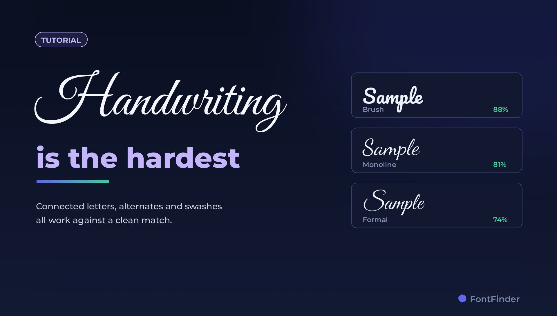
Script and handwriting faces are the hardest category to identify, and it is worth saying that plainly before you start. Wedding invitations, coffee packaging, beauty branding, signature logos — the type that makes you ask "what font is that?" most often is exactly the type that matching tools struggle with most.
The reasons are structural rather than a shortcoming of any one tool, and once you understand them you can work around several of them. This guide explains what makes scripts difficult and how to give yourself the best chance of a usable answer.
Connection
Letters join, so where one ends and the next begins is ambiguous.
Alternates
One typeface can draw the same letter five different ways.
Swashes
Decorative flourishes are optional extras, not the letter itself.
Sameness
Thousands of brush scripts genuinely look alike at a glance.
The Connection Problem
Matching compares letter shapes. A sans-serif n is a self-contained object with a clear beginning and end. In a connected script, the n shares a stroke with the letter before it and flows into the one after, and the join changes shape depending on the neighbours. The same word set in the same font at a different size can produce visibly different joins.
That means the thing being compared is less stable than it is for a sans or a serif. It does not make identification impossible, but it does mean you should expect a shortlist rather than one confident answer.
Alternates Make One Font Look Like Several
Good script fonts ship with many versions of each letter — a starting form, a middle form, an ending form, plus stylistic alternates. A designer setting a word by hand picks whichever looks best. Two samples of the same typeface can therefore share almost no identical glyphs.
The practical consequence: if you crop a word that uses heavily decorated alternates, you are asking about the alternates rather than the typeface. Crop a section using the plainest letters you can find.
Give the Matcher More Letters, Not Fewer
With a geometric sans, four letters can be enough. With a script, four letters is often a coin flip. Aim for a longer run — eight to fifteen characters — so the overall rhythm, slant and stroke contrast carry the comparison rather than one ambiguous join.
- Pick the longest continuous run of text set in the one script.
- Prefer plain lowercase over a decorated capital or a swash.
- Avoid words where letters overlap heavily, which turns two letters into one shape.
- Keep the baseline roughly level; a steep arc confuses the crop.
Quick action: Upload a clean screenshot or photo to FontFinder, crop around one font style, and compare the ranked matches with your real text before you choose a license.
Separate the Monogram From the Wordmark
Signature-style logos usually have a large decorative capital followed by ordinary lowercase. Those are frequently different things: the capital may be custom lettering drawn once, while the rest is a font. Crop the lowercase run on its own. The capital is often the part that was never a typeface at all.
Handwriting Fonts Versus Real Handwriting
Worth checking before you spend time: is it a font, or is it somebody's actual handwriting scanned in? The tell is repetition. Find two instances of the same letter in the image. In a font they will be identical, pixel for pixel, unless alternates are in play. In real handwriting they never are.
If every e in the image is subtly different, you are looking at lettering, and no font will match it. The useful goal then shifts to finding the closest font, which is a different question with a much better answer rate.
Reading a Script Result
Expect lower confidence than you would get from a sans, and read the list rather than the first row. Because so many brush scripts are genuinely similar, the top several matches are often all reasonable — and if the exact font is a commercial release, a close relative may serve your purpose just as well.
When you compare, look at:
- Slant. Consistent angle, or does it vary letter to letter?
- Contrast. Thick-to-thin variation, which separates a pointed-pen script from a monoline one.
- Stroke ending. Does the stroke taper to a point, cut off flat, or end in a blob?
- Baseline behaviour. Do letters sit on a straight line or bounce?
- The join itself. High connection, low connection, or barely connected at all.
Narrow the Category First
Scripts divide into families that look quite different once you know them, and naming the family makes the shortlist much easier to read:
- Formal calligraphic — high contrast, steep slant, copperplate influence. Invitations.
- Brush — visible brush texture, dry-brush edges, energetic. Packaging and sportswear.
- Monoline — even stroke weight throughout, often rounded. Modern and friendly.
- Casual handwriting — irregular, unconnected or loosely connected, informal.
- Signature — fast, slanted, highly connected, often with a long exit stroke.
Checklist
- Check whether it repeats — a font repeats, handwriting does not.
- Crop a long run of plain lowercase, not a decorated capital.
- Use more letters than you would for a sans-serif.
- Expect a shortlist, and compare slant, contrast and stroke endings.
- If the exact face is commercial, take the close relatives seriously.